h1

Evaluation

May 4, 2011

1. In what ways does your media product use, develop or challenge forms and conventions of real media products?

Similarities –

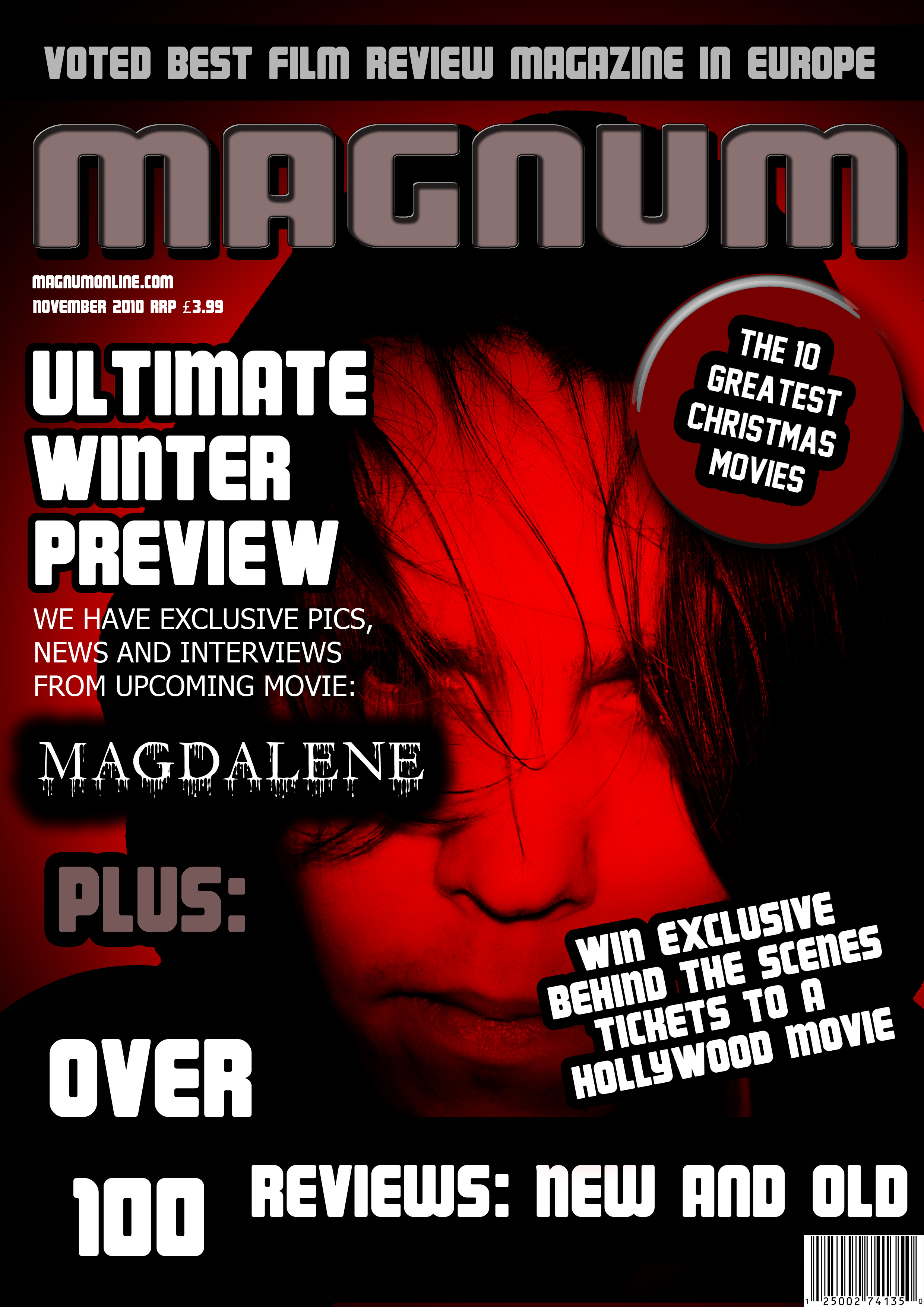
Large face at the centre of cover.

Large Masthead running across the top of the cover.

Competition mentioned.

Title of the issues main movie in large font.

Dulled or darkened colours.

Differences –

Cannot see the eyes of the main face on mine.

I mention the awards won by the magazine at the top.

I do not mention the names of any other movies.

Similarities –

The background is grey with a light centre.

The title of the movie is emblazoned across the bottom of the poster.

The picture is of something inanimate and is positioned in the centre.

Differences –

The strapline for ‘Grace’ is across the top of the poster and in a similar font to the title.

Mine has a reviewing quote across the top.

Mine does not have production notes.

The title ‘Grace’ is in a different coloured font to the rest of the writing on the poster.

Trailer – 

Similarities – Both trailers switch between a slow build up of tension to a quick release of fast paced editing.

Both trailers have interjected text between certain shots.

Both trailers use music throughout.

Differences – The number 23 had a more coherent and apparant storyline.

Mine is much shorter, more of a teaser trailer.

There is a lot of speech in the number 23 trailer and barely any in mine.

There are quite long sections from particular scenes left in this trailer, mine is largely all short snippets.

2. How effective is the combination of your main product (trailer) and ancillary texts (Film Poster, Film Mag Cover)?

I, personally, have never agreed with the Hypodermic model of audience reception. I genuinely believe that an audience does engage a lot more with its media than simply passively accepting everything. As a result, I feel it is important to keep audiences thinking, so they do not become bored with what they see. I do not like giving too much information away, be it through text on a poster, scenes in a trailer or a picture in a magazine. Instead, I like to suggest or imply things to the audience so that they piece together some kind of storyline themselves. This I feel I have achieved with my three media pieces. The trailer does not give too much of the storyline away, the magazine only gives away that the face is of somebody related to the movie and the poster just poses more questions overall. As a result, the combination of the three types of media combine to leave the audience questioning and thus hungry for more.
3. What have you learned from audience feedback?

I have learned a lot from audience feedback, including the following :

For my trailer I was told that it was too misleading, instead of it only hinting at the true storyline it seemed to tell a different one altogether so I changed this and added more scenes hinting at the true storyline.

The colours of my film magazine were not ‘horror’ enough and instead just seemed like a normal magazine so I deepened the colours to red and black.

The picture for my magazine is not scary or even sinister. I then re-evaluated the picture, darked it and hid the eyes.

The music for my trailer did not fit. I had used a Beatles song that, whilst I believed the music fit, the lyrics at least did not and hinted at a love story, completely different to my storyline. As a result I searched for new and more fitting music.

Having a lone voice speak over the rest of the trailer works quite well.

The rock effect of the arm in my poster was said to show ancient/ religious connotations quite well.

The storyline is interesting and well thought through.

4) How did you use technologies in the Construction and Research, Planning and Evaluation stages?

Research – To begin with I used ‘google’, this was just to get started by reading news reports and folk stories from around the world, to get ideas for a storyline. I then moved on to using websites like ‘IMDB’ for help with film names and posters. I used ‘Youtube’ to find trailers as inspiration and ‘google’ again for magazine covers. Though I also used the back catalogue section on the ‘Rolling Stone’ maazine website just to get a fuller idea of the progression of film magazine covers. I used CD’s and ‘itunes’ in order to search for suitable music and eventually ‘youtube’ again when I could find no music in my own playlist. I used microsoft word a lot as well, especially when writing the shot lists, storyline, character lists etc, this worked very well. For everything else I used old fashioned pen and paper.

Production – The most obvious addition in the prodcution side of things is obviously the camera. For the trailer it was a video camera from which I then uploaded the footage into iMovie HD and then continued to adjust from thereon. I also, for only one clip, used the webcam installed into the mac computers because this creaed and good effect when in dim light. For the magazine and poster I used a digital camera to take most of the pictures, the exception being the photo of my arm then used for the poster, this was taken using an iPhone as I wanted the poorer quality for a better effect when I altered it. And this altering took place using Photoshop, this was possibly the most used technology of all sat second only to the use of this blog, which was updated at the end of each lesson, or at least written about on paper and then copied up later.  I used Dafont for a large number of the fonts I used as well as a christian website for some information on various christian beliefs and quotes.

Evaluation – For the evaluation, the single most important technology is wordpress, simply because it is here where all my work is posted. I also used windows photoviewer to look back over screenshots to remind myself of various things that I created, devised and finished a long while ago.

h1

Construction of Film Magazine

May 4, 2011

My original masthead and background.

I began searching for an appropriate font for my Masthead and came across a font called ‘Magnum’. This I liked and decided for it to be the name of my magazine.

I then set about creating the masthead itself, I used emboss to get a slightly 3D feel to the title, making the magazine have cutting edge undertones.

From here I really studied what other features on a front cover other magazines had and put these into mine. Things like price, awards won by the magazine, date etc.

This is after studying other magazines

I decided at this point that what I had did not suit a horror issue of a film magazine and so I altered a number of the colours. I also began to think about the picture that would be placed in the centre. It was suggested to me that I find a picture online that looks like the picture I would finally want and to photoshop that in to mind, just to see if it works at all.

This is with altered colours and a template of what I want as the picture.

I also had to design the title of the movie, ‘Magdalene’. This was done by selecting a font from ‘dafont’ and using it in photoshop. Having seen this mock up I was not entirely sure that this is what I wanted so I changed my ideas slightly. I liked the red background, especially how the church looked n the background. I kept that effect but instead of it covering a building it covered my face as a close up. As you can see in this picture I altered the brightness and hue.

Here I altered the hue and saturation, as well as the brightness.

Here is my finished magazine cover and the comments made thereon by facebook.

The reviews of the magazine front cover were generally positive and this pleased me greatly. I liked a lot about this particular piece as I do think it looks quite professional. From the picture, with a sinister lack of eyes to the font and the masthead. In general, the people in class to whom I showed this said that it worked well, especially the colouration.

h1

Construction or Film Poster

May 4, 2011

The glass of blood.

Gave me initial inspiration

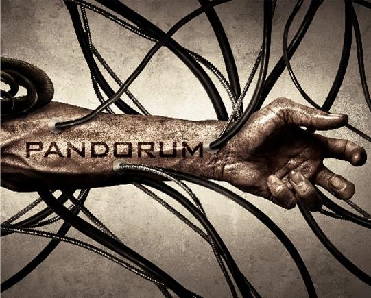
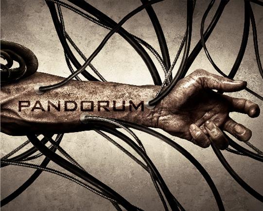
For a long while I had had no ideas for a film poster, with my film magazine taking precedence. I looked over the internet for anything that may have inspired an idea and came across the Pandorum poster. This lead me to the idea of having an arm as the main point of my poster and to show blood being drained away from it.

I created a synthetic blood by combining honey and red dye, this gave it a thick enough look to pass as blood. I then pured some into a glass and took pictures.

Next, I dribbled a small amount onto my arm, to suggest a cut or wound, and then then took pictures.

I uploaded both pictures into photoshop and cut around them with the magic wand tool. I then placed them one above the other and slightly darkened the arm, as it was too bright.

I then added a cracked rock effect to the arm, this added a slightly aged effect to the poster, making it seem a little ancient, closely tied to the religious aspect of my trailer. I also added a ‘plastic wrap’ effect to the glass, this came through experimentation of various styles and seemed to work to cover up the obvious streak of light reflected on the glass.

This is where I darkened the image of my arm and 'plastic wrapped' the cup

Made to look like a wound.

I also then added in the background, this was simply a very light grey with white streak down the centre. I tried with various other colours, including black but found the contrast of ‘horror’ and the purity of white, or at least largely white, interesting.

I then added in the quote at the top of the poster, from my magazine, and then a strapline for the movie.

At this point I felt the poster was still a bit bare and so I looked online for photoshop brushes, I found a set that had blood stains and blood drops so I used these to create the blood effects.

I moved these around for a while before deciding finally where to place them. I didn’t want to have too much writing at the top of the poster but needed to leave enough room for the titl

e to stand across the bottom of the page.

These decisions took me a while to get into place but I finally found a suitable place to put them. The other consideration was the font. Should I have the strapline and the magazine quote as the same font, I decided not to as this did not look pleasing.

Finally arranged and in place I added the names of the actors involved, placed the title of the movie across the bottom and was finished.

Here is my final poster – 

Here are comments made about it on facebook. 

I was generally quite pleased with the poster and how it turned out and the comments were generally positive. I do agree however that the names of the actors could perhaps have been improved upon if they were bolder. Even, perhaps if they were smaller but in a bolder font. My intention, opposed to the first comment, was not to sell the movie by using the actors names as the names are unknown, instead the poster itself was supposed to be the selling point.

h1

Film Regulation – BBFC

March 29, 2011

Case Studies

The film Cliffhanger was given to the BBFC and was asked to be cut down to be suitable for a 15 certificate. The BBFC cut out scenes they thought were ‘unecessary violence’. The BBFC then released the film to cinemas across the UK with a 15 rating. Cinema staff reported that in many cinemas, especially a number in east London, that during a scene in which a Cockney character kills a black man, audience members cheered. This prompted the BBFC to cut the film down further still for video release.

This case shows a support for the argument that films should be restricted. If it incites racial hatred in certain audience members, then the scene in question should be removed.  However, there are many films in which there are far more explicitly racist scenes that are left alone. Is it perhaps the relevance to the plot? If a story is set in pre-civil war America on a slave plantation then racism is relevant to the plot but in a film about mountain climbing, is it relevant?


A common misconception is that the BBFC banned the film A Clockwork Orange but in fact, despite the abundance of casual violence, the BBFC felt the film had enough of a resolution that it put the violence into perspective. The film, as a result was released in cinemas. The film’s director Stanley Kubrick received a number of complaints and even death threats to him and his family. He subsequently withdrew the film himself. It was re-released in 1991, after his death, by his family.

h1

Construction of Film Trailer

March 9, 2011

Once everything had been uploaded from the camera I began editing. I had had few ideas of how to arrange my trailer up to this point. I knew only that it should be quick and snappy, at least in places, to create a sense of panic and I had to have a few longer clips too, to add a slight amount of suspense before a quick set of snappy shots. With only really this in mind I set to work. As with my Jan Svankmajer project I began by taking all of my footage and chopping it up into seperate scenes, once this was done I began arranging it roughly into an order that told some kind of story. By this point I’d had an idea for music, it was a track by The Beatles called Happiness is a warm gun, there were no guns in any of my scenes but it was not the lyrics that were hugely important for my choice, it was the sound, mainly the guitar solo, that drew me to it.

So I uploaded the song into iMovieHD and set about reducing its length, this wasn’t too difficult as the song is clearly arranged into seperate sections so I cut out the sections I didn’t want. Once this was done I began cutting up my roughly arranged clips into carefully timed clips that coincided with the music. Doing this took up a good portion of time but once it was done I needed to put in title screens. I knew there should be the screen with the actual films title on it but I wanted more, somethig othe than just a title, a quote? a lyric? etc. I thought for a while then decided due to the religious themes involved in my film I would go for a bible quote, something about the eucharist. I went online to search for bible quotes, finding a huge array of websites willing to help.

Adding transitions my clips.

I chose the line ‘This is my blood, poured out for many, for the forgiveness of sins’ Matthew 26:28. This I felt could coincide nicely with the film poster which does involve blood. After placing this quote in and arranging everything properly I played my trailer to a few people to get feedback. The biggest concern expressed by most people was that they didn’t really understand the storyline. I realised then that to an outside eye, somebody not previously aware of the storyline, the story was not clear at all and in fact rather than not telling a story at all, told a different story entirely. The other concern was music, whether it worked well or not. I personally thought the music did work well, it had enough of an eerie and raw sound that it helped create an horror atmosphere, the line ‘Mother Superior jumped the gun’ is repeated over and over as the music builds up towards a climax which I felt worked well in leading the trailer to its resolution. It was not to be and with the voice of the people saying get rid of it, most people anyway, I changed it. My main concern now was arranging these clips into another order so as to give a better understanding of my storyline, first I needed new scenes. I took the camera that night and filmed with a friend in my village. This new footage included a clip of somebody speaking, something I did not use the first time round. So I now set about arranging these clips into a workable order but was again struggling with the lack of music to guide me, so I roughly placed everything in an order that made chronological sense and went in search of music, it had been suggested to me when people had watched my last attempt as to what kind of music they thought would work and gregorian/ choral chanting was something tha came up, perhaps even something slightly remixed  to have more of a beat. This search took a very long time, I could not find anything that I felt would work, I asked other people what they thought of certain pieces and they too agreed that there was little that would work. I abandoned, temporarily, my search for music and tried cutting the scenes down into an interesting progression. After another attempt at finding music I came across something that worked and immediately put it into iMovie HD to cut it up. Once this was done I could set about tidying up the clips and making them coincide with the music after doing this it was suggested that there was not enough reference to the book in my trailer so I quickly

Inserting the movie title as a still frame in my trailer.

filmed a clip of a large old looking book being slowly turned by an anonymous hand wearing a large, stonemason-esque ring. I then placed this as a quick flash at various points throughout the trailer. Having done this I then realised that I had not placed back in my title screens and that by doing so I’d move the timing of my piece out by enough that i’d have to go round and sort out the timings for the music throughout. Luckily I managed to rearrange the scenes in such a way that this was avoided. So here is my finished Trailer  –

h1

Research for film trailer

March 8, 2011

Researching Film Trailers:

When researching horror trailers I aimed for more psychological horrors as these films interested me more. However, I did choose a few non-psychological horrors as well since my questionnaire on what kind of movie to make had not yet been completed, so I couldn’t presume that people would want a psychological horror.

The Shining

The trailer starts with dialogue from the movie, this is played over several interspersed establishing shots. As the content of the dialogue becomes steadily darker it reaches its crescendo with the line ‘he killed them with an axe’. At this point it creates a moment of shock by breaking the quiet tone with a sharp rise in pitch from the violins and a loud ‘bang’ as the axe hits the door. Dialogue runs throughout most of the trailer, sometimes played with its respective clip, sometimes played over others. It does this again, the change from a slow, calm scene to a quick loud shock and a short clip. It effectively tells the story in the opening dialogue and then shows you it unfold throughout the trailer. Music fits the clips and is used sparingly.

Hide and Seek

Again, this trailer too starts with dialogue, establishing shots, calm music and then escalates as the problem unfolds. The music is calm and serene to begin with, slowly becoming more and more eerie. Then with a sudden change in pace as the action kicks in the strings rise in a crescendo followed by a final bang and silence for the credits and film title. Dialogue is used throughout and is all from within the film. It is over 2 minutes long and tells the story in a fair amount of detail from start to finish.

The Wicker Man

This trailer differs from the other two in that it does not tell the entire story, this I prefer as it does not ‘spoil’ the movie when watching it and leaves the audience to discover the story for themselves. Its use of music is different as well, where the others used fairly minimalist music that sharply fitted the action onscreen this trailer uses music that doesn’t directly fit. It starts with a bass drum beat with a harrowing voice reading what sounds like a biblical passage, it then kicks into a 60’s guitar riff and continues in the background throughout. The horror in this piece is not so much directly expressed through the music but in fact it is the juxtaposing blend of swinging 60’s music with harrowing or just bizarre footage (people dressed in odd outfits playing instruments and dancing, the main character screaming in terror or finding a dead body). The storyline is hinted at, we know he is a police officer investigating a missing girl and that weird things begin to happen, other than that nothing else is mentioned, I like this effect, it helps create more suspense also more desire to discover what was going on.

Number 23

This trailer I found quite interesting as it didn’t actually have much action or direct horror. There are no monsters, bad-guys, aliens, ghosts, no particular antagonist at all. Rather the antagonist is the protagonist and his paranoia, the story line is not hugely given away, we know he finds a book and becomes obsessed with the number 23, we don’t know why it is relevant or how it is resolved. The fact the trailer still displays that it is a horror film despite the lack of horror scenes intrigues me. The choppiness of the cuts, the lighting, the camera angles, all these play the part of the antagonist, it is this that scares you not anything on the screen.

In summary it would seem that the average length of the trailers is about 2 minutes long, this seeming to be the optimum amount of time to set the scene and tell the story. I’m not sure about this and think it could be achieved in a shorter amount of time and by giving less away, I will see what the results of my survey say when they are done. Dialogue seems to play a major role in the trailers that tell the entire storyline whereas it seems secondary in ‘The Wicker Man’ and the focus is more on the camera work, similarly with The Number 23 the use of light and dark and close-ups brings out the horror rather than telling much storyline. This is possibly something I want to try in my piece, less dialogue, not much direct action but false scares and paranoia. The music generally starts quite pleasant or silent and then works up to build tension; alternatively a song that seems happy is used against a horror scene, this juxtaposition being odd and therefore slightly uncomfortable. Generally dark scenes but a few light scenes nearer the beginning, usually ending on a dark screen with writing after a loud bang or crescendo.

h1

Research for Film Magazine

March 8, 2011

Research Film Magazine

Total Film – Inception

When the film, Inception, was first devised it was intended as a horror, it slowly transformed into a thriller as they adapted it but it still retains some of its horror influence and the Total Film magazines Inception issue shows this. The main picture is a dark figure of Leonardo DiCaprio staring into the distance, half darkened by shadows, the expression on his face seems concerned but intent, and the fact he is holding a gun suggests his intentions are to kill. The main body of writing is across the centre of the cover stating the title of the magazines main film review ‘Inception’ and also the subsequent articles arising as a result of the films review, i.e. ‘the 27 most mindblowing films’ and ‘meet the master of mind flicks’. The premise of this edition, as a direct result of the release of Inception, is psychological movies. This can be seen with the design of the masthead which shows computer processing chips and other electronics. The cover only has three colours Red, Grey and Blue. Red for the Tag-line to this issue Blue for the lighter background and grey for most writing, some being in red or white. The title of the magazine is biggest but also blends into the background more so than the other writing. Above the masthead is the line that sets up the tone of the issue. The website, price and date are very small and just under the title. The most eye-catching text is the title of the main movie to be reviewed and it would be that that drives sales rather than the magazine itself. Some people would buy the magazine because they like the style/ writing etc. but most people will see the big title ‘Inception’ and it will be their motivation to see that movie that will urge them to buy the magazine.

Empire – Batman: The Dark Night

Large title, in red, across top of page with a strap-line giving the title of the main movie in focus. The rest of the text is either in purple or green (The colours of The Joker, who is the main picture). Instead of having the films title as the main textual focus we have the words ‘Meet the Joker’ followed by a quote ‘He’s a cold-blooded, mass murdering clown’. That quote alone would intrigue a number of people, the juxtaposed situation created from the imagery of a mass murderer and a clown is one commonly drawn on in horror (The movie ‘It’ or ‘House of 1000 corpses’). Advertising other articles and features is on the right side of the page. The quote and ‘Meet the Joker’ are in a different font to the rest of the cover.

Entertainment Weekly – Sweeney Todd

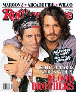
The main focus of text is directly below the masthead. This focus is not in relation to the main picture of the issue. The picture is of Johnny Depp in character as Sweeney Todd but the Title of the movie is in tiny font in brackets under the much larger heading ‘Johnny Depp’. This magazine choosing its selling point as the actor rather than the movie. There are only three coloured fonts used, either white, blue or red. There is no active background just a backdrop behind Johnny Depp. Below Johnny Depps nameis a list of all the other actors mentioned throughout the magazine, again choosing to advertise themselves through the actors rather than their movies.

Overall

Either the film or, if they are popular enough, the actor is used to promote the magazine, since none of my actors will be famous it would be better to use the film as the selling point. The title of the magazine should be the biggest text and standout but can be placed behind the main picture as long as the majority of the name is visible. Articles should be placed generally on the left hand side but whichever least covers the main picture. Should be a colour scheme for the magazine to show that it is of a particular company. Font should be generally the same changing for titles and names, changing size and colour as well.

Opinions on Horror Films

I asked a group of 11 people their opinions on horror movies and what they look for in those types of films.

1.Which style of horror film would most appeal to you?

  1. Slasher – 2

  2. Psychological – 6

  3. Sci-fi – 2

  4. A monster (i.e. Vampires/ Werewolves etc) – 1

2. Which of these concepts seems most scary to you?

  1. Fear of the future – 0

  2. Fear of ones own unconscious mind – 5

  3. Fear of the unknown – 5

D. Fear of a creature – 1

3. Do you think violence and gore are crucial to a good horror film?

  1. Yes – 2

  2. No – 9

4. Which of these popular horror film’s style appeals most to you?

  1. Saw – 2

  2. The Shining – 7

  3. Hide and Seek – 2

  4. Blair Witch Project – 0

5. Which of these settings do you think is the scariest?

  1. Abandoned house – 3

  2. Graveyard – 3

  3. Woods – 4

  4. Back Alleys of a city/ town – 1

6. Would you say a film could be made scarier by use of black and white film?

  1. Yes – 5

  2. No – 6

7. Would you describe yourself as a horror fan?

A. Yes – 4

B. No – 7

h1

Evaluation – AS Coursework

January 4, 2011

In what ways does your media product use, develop or challenge forms and conventions of real media products?

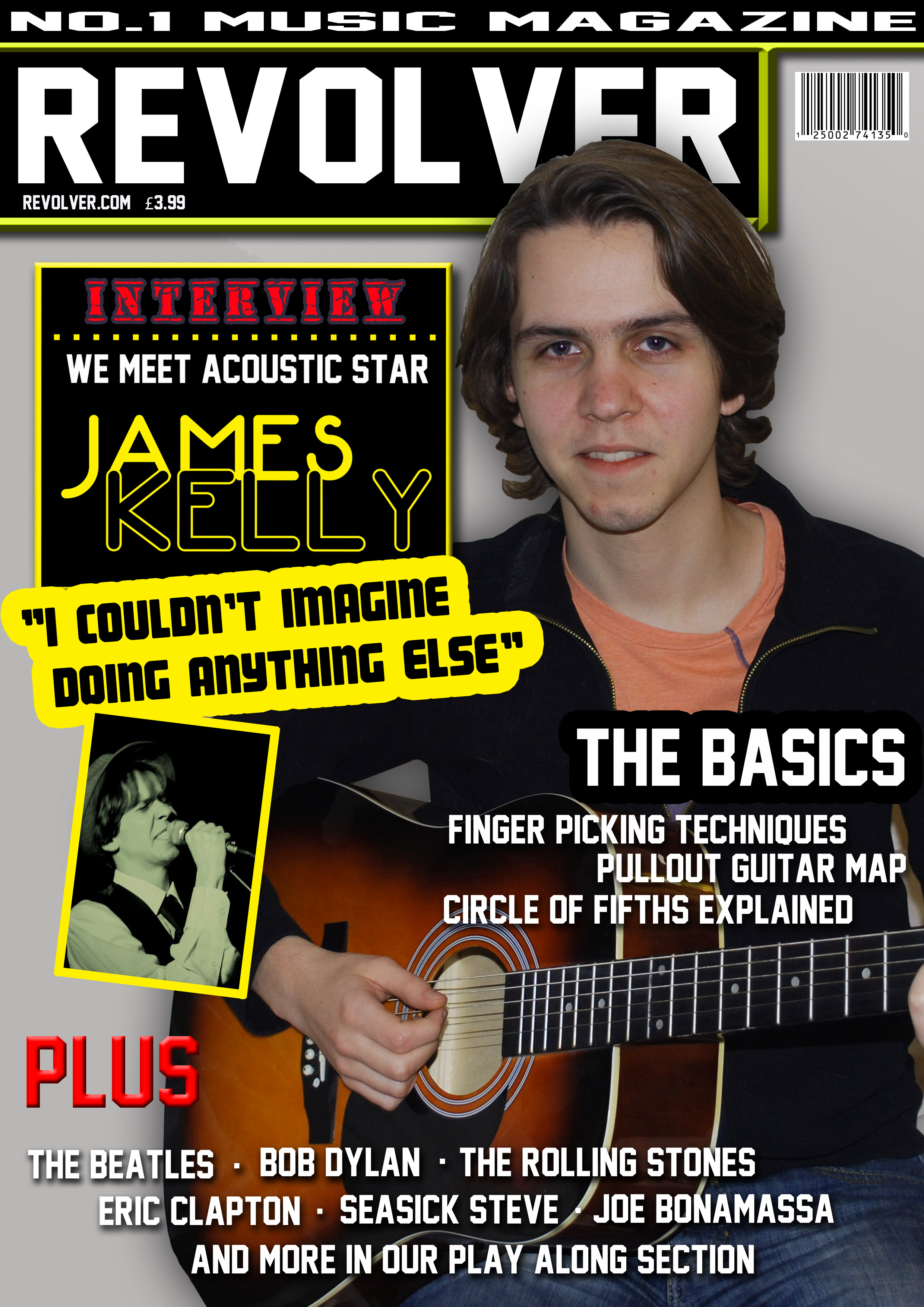
  • Masthead is bold across the top of the page, stands out (white on black).
  • Model is over the title.
  • Name of the model is larger than other headings (excluding masthead)
  • A Promotional statement is used to help increase the reputation of the magazine.
  • The colour scheme is largely yellow and black which connotes ideas of warning signs or a police crime scene, this coupled with the title of the magazine ‘Revolver’ give the magazine rebellious connotations. Rebellion being commonly associated with folk/ acoustic rock.
  • A quote from the star interviewee is placed under the advert for his interview.
  • A black box is used to house and frame text.
  • Most magazines place the bar code somewhere near the bottom but mine is placed in the top right. This was done as it looked less cramped than if I were to place it at the bottom with other writing.
  • Model is not heavily made-up and does not have extravagant clothing as this would not be in keeping with the folk/ acoustic rock feel. Folk rock especially being seen as counter-culture and therefore generally opposed to the ‘touching up’ used by more popular artists in photo shoots.

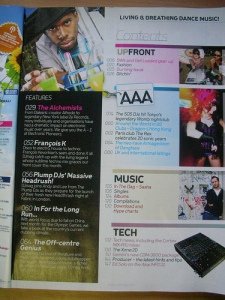
  • Separate categories under different headings.
  • Same colour code as front cover. (Black and yellow, white writing)
  • Promotional offer/ Competition/ giveaway.
  • There is little mentioned in the contents. This is a result of the magazine covering a wide range of material and changing its content widely every issue, as such only the regulars and cover features are mentioned.
  • Ambiguous picture. Don’t give too much away.
  • Page number. (Top right)
  • Date of issue.

The overall colour scheme used throughout my product both reflects and challanges the conventions of a folk/ acoustic magazine. Stereotypically folk music has an association with ‘hippie’ or ‘psychedelic’ styles and I feel my magazine has this but curbs it. Instead of going all out and having wild and vivid colours plastered across the page I decided to take that idea and make it more reserved, as I come to mention in the next section this magazine will be read by an older audience and the reserved colours (whilst still retaining some vibrancy) would appeal to them.

How does your media product represent particular social groups?

My magazine is aimed at readers generally between 25 and 50. The range is vast as the magazine covers music spanning a long way, this means older generations would enjoy reading about music they grew up with yet the bands are generally popular enough to still be able to attract younger generations to them. (Bands like The Beatles and The Rolling Stones who still attract younger listeners today). The language and linguistic structure are moderately sophisticated, meaning this is not a conventional ‘pop’ magazine, intended for a quick an easy read but rather something you might spend some time reading. The magazine also has a feature in which beginning guitarists can learn simple techniques that allow them to develop their guitar playing, as well as tabs and sheet music for popular songs.

Front cover

  • Lists all the artists whose sheet music is available in the issue. (Attracting any guitar players – beginners or otherwise)
  • Colour scheme is vibrant enough to attract younger readers yet the font is plain enough that it won’t deter older readers.

Contents

  • Simple and easy layout, easy for older readers.
  • Competition to entice younger readers, yet this specific prize would attract guitar players as well as general fans on Eric Clapton.
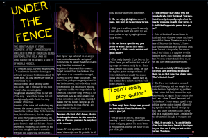
Double Page Spread

  • The opening preamble is written in a sufficiently sophisticated way to appease the more discerning reader.
  • This is seen in language such as ‘metamorphosed’ or ’emanating’.

What kind of media institution might distribute your media product and why?

My magazine would be available in shops that offer a wide range of magazines, such as WHSmiths or a supermarket like Sainsbury’s as music magazines are less common in smaller shops with a smaller range. My magazine would also be available for subscription, offering discount prices, exclusive features and full access to the online counterpart. This offering full interactive articles, exclusive interviews and video tutorials.

Who would be the audience for your media product?

My intended reader would have a general interest in the guitar itself but also be a fan of various acoustic and electric styles. There would be little content on ‘heavier’ music so that audience would not read my magazine. As aforementioned, my audience range vastly in age but here is an example of my intended audience, both young and old.

Typically my audience would wear comfortable clothing whilst not looking scruffy. They would be keen readers, the magazine offers a lot in the way of literary content, would be open-minded, keen to learn and generally quite liberal people.

They would have been to many live gigs, own many live dvd’s and have an extensive music collection, made up of new and old bands. They would all have a relatively eclectic taste in music, genres spanning from classical acoustic guitar to political protest folk songs as well as rock and blues.

How did you attracts/address your audience?


  • The colour scheme connotes ideas of living dangerously and being slightly rebellious and this would attract the type of person most interested in the content of this magazine. Somebody relatively intelligent.
  • The main textual focus is on the name of the celebrity thus my magazine uses the popularity of the star to help sell copies.
  • Mentions the names of a wide selection of artists.
  • Offers guitar lessons and techniques for beginners and experienced guitarists.
  • Simple contents page graphology, does not overwhelm the reader.
  • Complex language and literary style idiolect.
  • Covering part of the title with the artist works in favour of the magazine in two ways, it connotes the idea that the star is very popular and therefore more important but also that the magazine itself is popular enough that it is able to cover part of the title without anyone now not recognising it.
  • Pictures a guitar on the front cover.
  • Picture is a midshot, allowing a personal yet not intrusive look at the star. It is also angled straight on so that the audience feels equal to him.

What have you learnt about technologies from the process of constructing this product?

Largely, I have been using Photoshop for this piece of work and it is fair to say that it has a number of advantages.

  • Easy interface, everything is clearly set out.
  • There are many online tutorials to help you.
  • The layers tool is very good, it allows for easy build up of picture.

There are also a number of disadvantages.

  • Layers take a while to get used to.
  • The magic wand tool is temperamental
  • The number of different tools means Photoshop can be daunting at first.

Photoshop was a struggle for me and to begin with I was blindly toeing my way forward without really knowing what I could do. This improved with practice to the point that I feel almost confident in using the software.

InDesign was the other main software I used. Here, I feel, there were less advantages.

  • Help clearly lay out the graphological features.
  • Accurate in lining up pictures and font.

And a larger number of disadvantages.

  • Too much to pay attention to, overwhelming.
  • The lines can be confusing.
  • Things like text boxes can be fiddly.
  • Uploading pictures is difficult to do well.
  • Resizing pictures is very difficult without an air of trial and error.

InDesign, I learned, is a great way of accurately laying out your article but overall, I felt it had far too much ‘going on’ and this served to be more confusing than rewarding.

Looking back at your preliminary task, what do you feel you have learnt in the progression from it to the full product?

My College magazine was very slow to get going as I took a while to become used to using Photoshop. After doing my college magazine I decided to do some video tutorials to help improve my abilities. This, I feel, helped enormously as it built my confidence in using the software and also taught me a few tips on acquiring certain effects. I have learned the importance of planning, as I came to work on photoshop I had no clear image in my mind of what I wanted. This slowed things down but before starting my music magazine I’d planned roughly what I wanted and was therefore able to start setting everything up, ready to simply drop pictures into place.

Here in my preliminary task there are a number of things that I changed for my final product. I had no colour scheme, other than plain black and white. The picture used is grainy and of a poor quality, this makes the model appear out of place in relation to the background. In the preliminary I went with the idea of writing on top of coloured shapes, I went here for a circle but felt this did not work too well, during audience feedback I was told that it didn’t work because it didn’t have a border surrounding it and as a result it did not stand out and merely blended in with the rest of the cover. I decided to completely change this then when it came to my final cover and instead, in keeping with my now decided colour scheme, I chose to make the borders yellow as this stood out the most from the rest of the cover. In the preliminary task also, there is no variation in font type, this was addressed also in the audience feedback as they made clear that without the variation the cover was very dull, coupled with the plain colours. I decided against using a photograph as a background for my magazine, most of the magazines I researched had shadows on a plain colour, as I felt that the main photograph may look out of place in comparison, on a plain coloured background an audience member would not look and try to make the image fit with the background as it is a plain colour and has no reference points. I moved the barcode on my final product to the top right of the cover as before having done this there was a large section of the cover that had nothing on it and this empty space is generally not appealing to an audience.
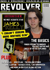
I have, however, kept the price and website of the magazine directly under the masthead as during research i found this to be the most common location. I also liked the idea of the model actively doing something, rather than just posing, this is an idea that i kept with my final cover, however, I changed the facial expression, the college magazine was supposed to look as if he was bored of working, ‘homework blues’, but instead it just looks like a poor choice of photo and as such decided to use a smile but still keep the action and have the model playing guitar.

In my college magazine contents we can see that i have kept the same font style and colour for the title of the magazine but unlike the cover I have used other fonts. I also played with colouring font, at the bottom of the page, I put ‘£100 in vouchers’ in yellow so it stood out more from everything else. Still not having a colour scheme as such, everything stayed pretty much black and white. I adapted this greatly as i researched more for my final product and saw the importance of colour schemes. I was also told during audience feedback that simply placing text onto a background did not seem to prove effective and that i should use shapes or colours to write on. I liked the idea of having some kind of banner or ‘stand-out’ competition advertisement but in the preliminary task this was not particularly bold and didn’t really standout so I made sure I made the competition stand out more on my final contents page. I used a colour that varied from my colour scheme to do this. I had no date or page number on my preliminary task and this was due to a lack of attention to detail, I was obviously aware that these features appear in magazines but I overlooked them.

————————————————————————————————————————————————————————————————————————–

Audience Feedback

1. Do you think the colour scheme is effective in catching peoples attention?

Yes – 13                            No – 7

2. Was the layout too simple?

Yes – 4                             No – 16

3.  Were there enough pictures?

Yes – 9                             No – 11

4. Was the textual content of the double page spread interesting?

Yes – 14                             No- 6

5. Was the writing style appropriate for the magazine?

Yes – 18                            No – 2

6. Was there enough information in the contents?

Yes – 15                           No – 5

7. Would you buy this magazine?

Yes – 18                          No – 2

Having discussed my final product with a group of friends I asked them the above questions. For the most part their responses did not surprise me, most felt that it was eye-catching, was not too simple and was well written. One of the main points that was brought up was in relation to my double page spread which they all agreed, excluding 2, fit the style my magazine was going for and was written in an interesting way. I was aware of the lack of photographs in my product and this really was down to poor planning, my aim had been to photograph friends but then after a few hiccups and problems I ended up having to photograph myself and my guitar. If I were to have more time this would be one of the major things i would change, I would most likely put a lot more photos in the contents. Having said this however, the audience feedback was generally positive in relation to the contents page. Here is what was said of my product when I posted it on Facebook. The comments on facebook agree that the contents is not too overdone, the amount of pages listed is enough not to leave the reader feeling overwhelmed, it is also easily laid out. I mildly agree with the comment made about my front cover which states that I should have used a different background maybe brighter colours. I agree that i would probably change my background but I am unsure as to whether I’d use specifically brighter colours.


h1

Research for AS Music Magazine

November 28, 2010

I have looked at three different magazines in particular as an inspiration for my music magazine front cover. The magazines in question are Classic Rock, Total Guitar and Rolling Stone. All three of these magazines cover generally similar musicians.

What I like particularly about this Classic Rock cover is the sultry and darkened tone. To me it suggests sophistication, as if the magazine holds deeper messages and not just the pop, brightly coloured, ‘celeb news’ of a lot of magazines. It is also a very simple front cover, it has the subject directly in the middle of the page, a large white title . All the subsequent titles are purple/ pink and writing in white. This style is very simple, it doesn’t require much effort to take in (owing to its darkened tones and straightforward font and colouring). The image used, as well, is very simple, there is a sole figure (Axl Rose) taken at a mid-shot. The picture does, however, stray from the usual conventions of a magazine cover, which is usually well lit and bright, and has Axl half shrouded by shadows. The subject matter concerning Axl Rose is quite dark, which is connoted by the strapline ‘Machine guns, LSD and ‘Ayatolla Axl’ as well as the dark picture and black background. Up in the top left of the cover there is a small promotional offer, on what is made to look like a post-it note, offering a free CD. On the same side of the cover but below the main title is a red circle on which it advertises a ‘lost issue’. The red circle stands out against the black background and the fact it offers a ‘lost issue’ makes it seem as if the audience member reading is reading something exclusive and never before seen.

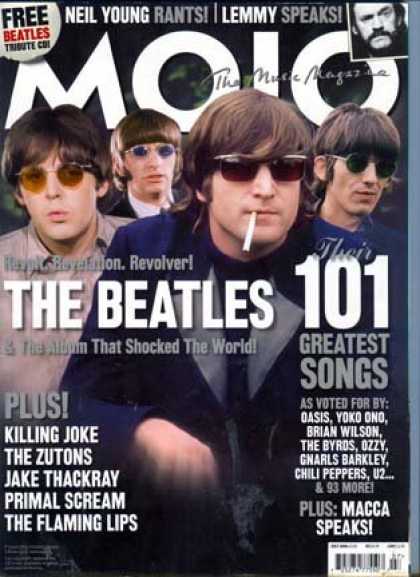
There is one thing in particular that i like about this Beatles edition of Mojo magazine and that is the fact that two of the titles on the page seem to run together whilst also working independently. In large white font it says ‘The Beatles’ then immediately to the right of it is a separate title saying ‘101 greatest songs’. The effect this causes is that at a glance (how most magazines would be viewed in a shop) it seems as if it says ‘The Beatles 101’ denoting a deep examination of The Beatles with extensive coverage, information and perhaps interviews (old or new with surviving members). Again, as with the last cover, I like the fact that the font is simple large white font with straplines in grey. This doesn’t overwhelm the reader with colour or a confused looking front cover full of writing. It also has a dark background, like the last one, which again denotes, to me, a sense of sophistication.

Audience Feedback from research

1. Should the magazine cover have loud, vibrant colours or duller or darker colours?

Brighter – 16                  Darker – 4

At this point I asked an open question and will briefly summarize the general response.

2. What about the front cover of a magazine first grabs your attention?

I put forward a few ideas to help move the conversation along and prompted with ‘is it the colours? the pictures? the text?’ To which a lot of people said the pictures were the most important thing. They said that when they first glance at a magazine they generally stop and look because they see a celebrity they like and then from there they take into account the text and colouring. From this the general consensus was that the picture was most important.

3. What is the best option for the text font?

Bold – 20                Plain – 0            Handwritten – 0         Cartoon – 0

The previous question was an unanimous answer made by the audience, they all felt the other three were not appropriate for a magazine front cover

4. Is a consistent colour scheme important to you as a reader?

Yes – 14                 No – 6
5. Should the language in an article be

Written in an interesting way – 12                        Used only to further the topic at hand – 8
This last question may not seem clear, what I meant by it is should the language in the article be used only to drive along the topic of the article itself, thereby the information is what is interesting and the linguistic style is unimportant or should it be both, i.e. provide the same information but be written in a less direct and more ‘flowery’ or interesting way.


h1

Research for Film poster A2

November 24, 2010

http://www.filmposters.com/catalog/results.asp?ProdCat=22&PosterSize=&star=&director=&title=&decade=&country=&ScrollAction=Page+6

I’m gathering ideas from across the internet for my film poster and I am looking at horror in general as well as specifically psychological horrors. From the examples I find I will take ideas for my own poster.

The two posters (Bundy and Dark Places) are examples of horror movie posters. DP is a typical horror from 1974 concerning the idea of evil forces, dark spirits, evil cults etc (typical of its time with movies such as The Exorcist and The Wicker man) and as such follows a typically Gothic theme with a green/grey skull placed behind a red scythe. The green on the skull would have been used to denote age and depth of decay that has occurred in the skull, the red obviously denoting blood, danger death etc. Bundy on the other hand is much more of a psychological horror detailing the mind of a deranged serial killer. As the style of horror is different it uses different methods to display the content of the movie. Instead of Gothic/ religious connotations to express evil and demons etc it is more the evils of humanity and of individual humans. This poster sees a mid shot of a man looking into a mirror that has two extra mirrors framing it, giving three copies of the original man each one blurred or warped in some way. This connotes his unstable murderous mind (as presumably the man in the poster is Ted Bundy) and shows how human beings can look so normal and alike one another but truly we are all warped and deranged.

I saw this Pandora poster and the darkness of the skin caught my eye, how it is made to look grubby and mud-covered. Also they way the wires become the veins I thought looked particularly good. I also enjoyed the fact that this doesn’t have any particularly horror features about it yet still seems quite creepy and makes you feel uneasy with it.

Researching Film Posters

Final Destination

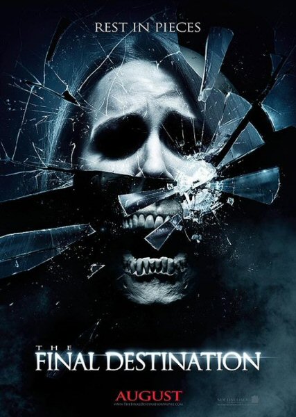
In this Final Destination poster we see that the main body of the poster is taken up by the image of a glass face, with a skull jaw, smashing. It’s made to look like a portrait either as a picture frame or mirror that is being smashed, connoting the idea that a bad event will cause destruction, of some ones life or physically. The black background, used to suggest the unknown and therefore fear, accompanied by a light smoke around the edge of the poster. The top of the poster has the tagline for the movie ‘Rest is Pieces’. The tagline is a play on the phrase Rest In Peace, a phrase used when referring to the death of a person, but is used in this case to suggest a cruel or painful death. The title of the movie is along the bottom of the poster, much larger and brighter than any other text used. The only other text is at the very bottom which gives detail of the release date and production company etc.

Scream

This poster takes a similar approach as the Final Destination poster. It has a picture, again a face, as the main focus, taking up the large majority of the page. This is a close up shot of a woman’s face, her skin colour has been lightened to make her seem paler, more deathly. Her face shows shock, or horror, denoted by her wide eyes and hand across her mouth as if in shock. The Title of the movie is displayed at the bottom of the page in large, bold font. At the top of the page is the film’s tag-line. Under the title are the actors credits, producing information and release date.

The Strangers

This poster shows a woman in a room seemingly oblivious to a ghostly character in the darkened corner of the room. The lack of any emotion in her face and body position denotes that she is either unaware of the horror she will face or is herself a part of it. The picture takes up the main body of the poster with tag-line at the top. The Title is again near the bottom, under the main picture, but this time has the names of the main actors listed above it. Below the title it is told that the movie is based on true events, with production details at the very bottom in small print. The title is written in a different font, with a glowing effect in place.

The Number 23

This again shows a close up of a face. Faces, more particularly, eyes, seem to have a strong connection with the horror genre, perhaps since human eyes mean that you are being watched by a conscious being and the emotionless expression can be quite unnerving. In this case however, the face is that of Jim Carey, so there is a recognition with the face but he is still blankly staring at the camera. This time the name ‘Jim Carey’ is adorned across the top of the poster and the title is relatively small, tucked in the bottom right of the poster, yet still due to its bold white font, it sticks out. The name of the actor on this poster is bigger that the title but due to its dull red and elongated, yet not heightened, font. The tagline is small and only distinguishable from the production notes because of a different font and the same red colour as the actors name.

Overall

The main body of the picture is always the main focus of the poster, not the title, release date or actors names, the picture must either intrigue people enough to want to find out the details or it must tell enough about the type of movie it is to make people want to see it. The movie title is not as important as the picture but is second to it. All films have tag-lines, usually a play on a well known phrase or lyric, sometimes a pun, sometimes a quote, bible quote etc. The title of the movie never goes at the top (like a magazine title), usually the top of the bottom third of the poster is the title. Dark, dirty or dusty is the general norm but I think it is possible to strike a message of horror without this, like the example of the movie ‘The Strangers’.

Create your own website, free on WordPress.com.Create your own website.
Start free